Working on the TEDxSquareMile identity was a fun creative puzzle, how do you make something feel fresh and unique when you're working within strict brand guidelines and a tight budget? The answer, it turned out, was hiding in the theme itself.
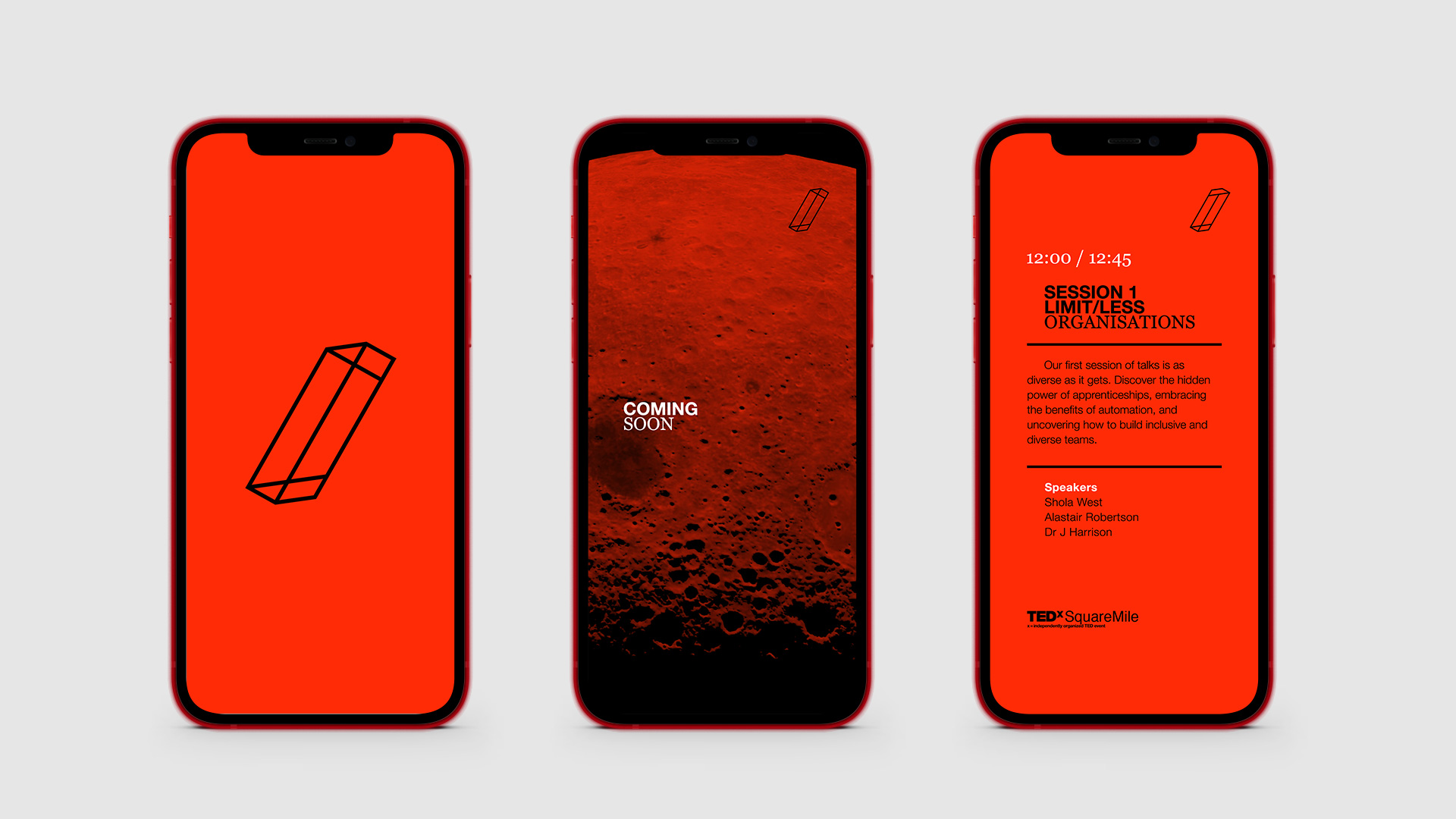
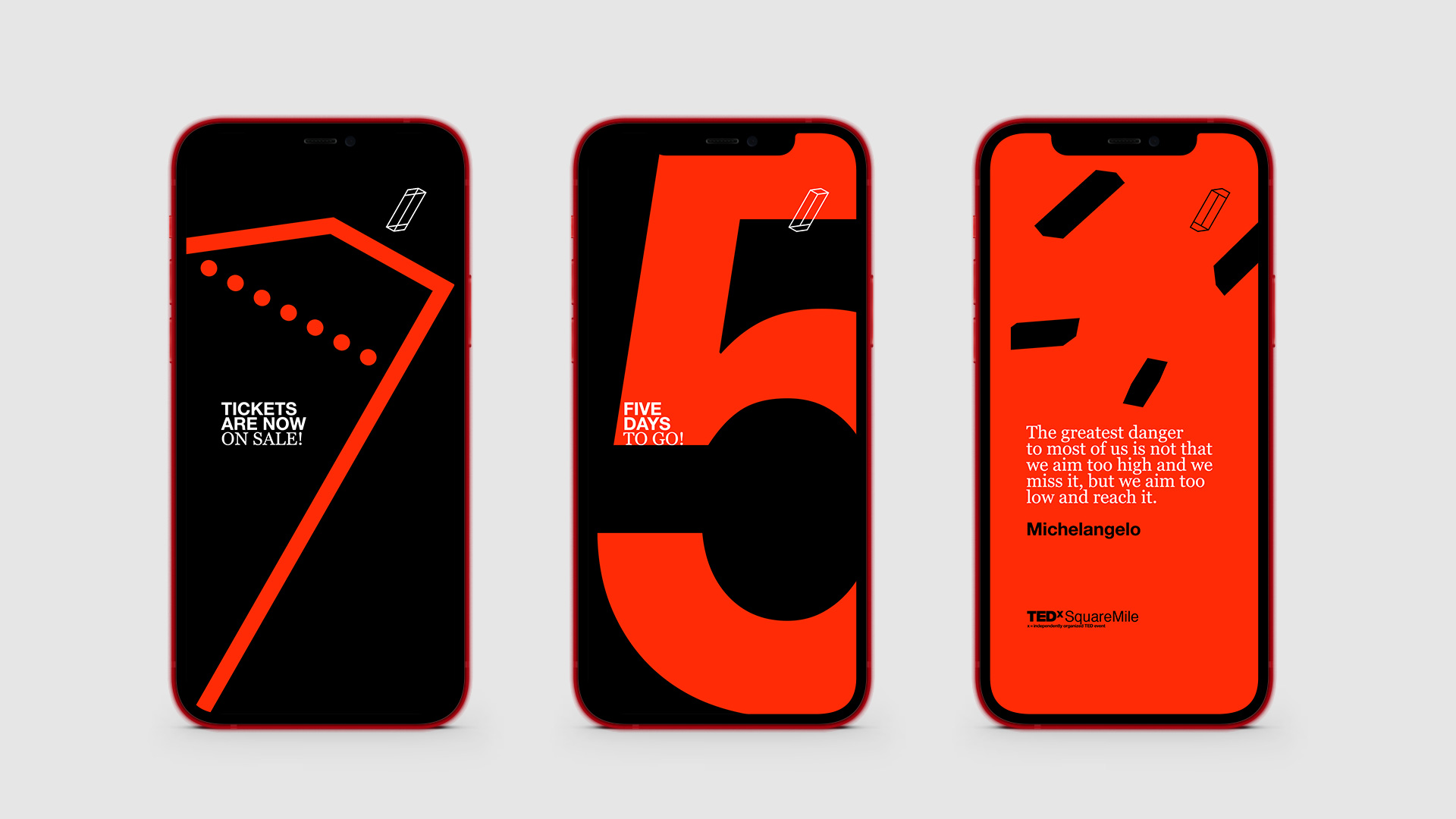
LIMIT/LESS is split into two parts, LIMIT and LESS, divided by a slash that captures the rebellious spirit of the event perfectly. Rather than letting the wordmark sit passively on the page, I put the slash to work, making it the beating heart of the whole visual identity.
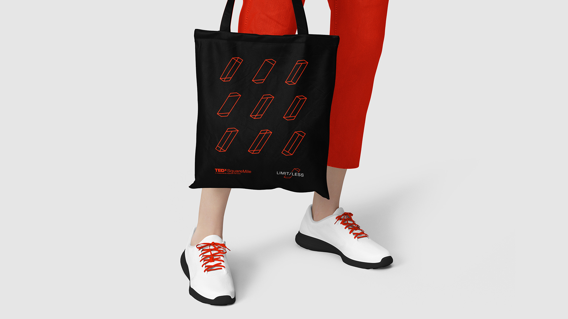
From there, I developed nine variations of the slash, each one a different interpretation of the theme, inspired by M.C. Escher's impossible figures. The idea that the logo could exist in multiple versions felt like a natural extension of LIMIT/LESS itself — a concept that's at once contradictory and full of possibility.
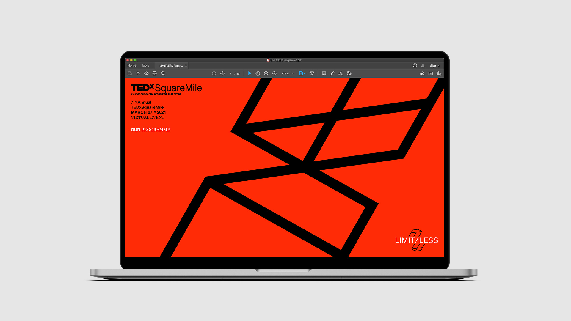
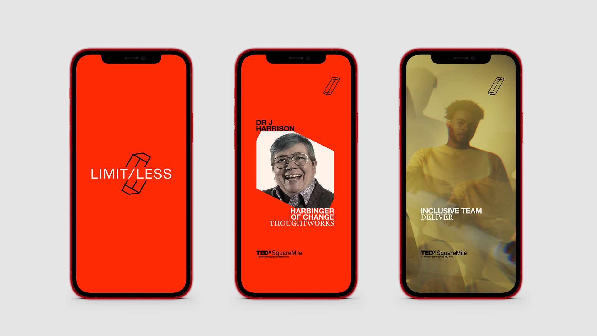
The final result is a visual language that stretches across social media assets and the streamed event experience, feeling cohesive and recognisably TEDx, while still having a personality entirely its own.
![]()